
Updated: October 25, 2026
Correction and look are two different jobs
Colour work in an edit divides into two stages that get confused constantly. Correction makes the footage accurate and consistent. Grading gives it a character. Doing the second before the first is why so many videos end up looking stylish and wrong at the same time.
Correction is technical. It sets black and white points, balances the image so neutral things are neutral, fixes exposure differences between shots, and makes three cameras that recorded the same room look like they were in the same room.
Grading is creative. Once every shot is neutral and consistent, you can push the whole thing warm, cool, contrasty or soft, and it will move together rather than exposing the differences underneath.
Starting from log footage
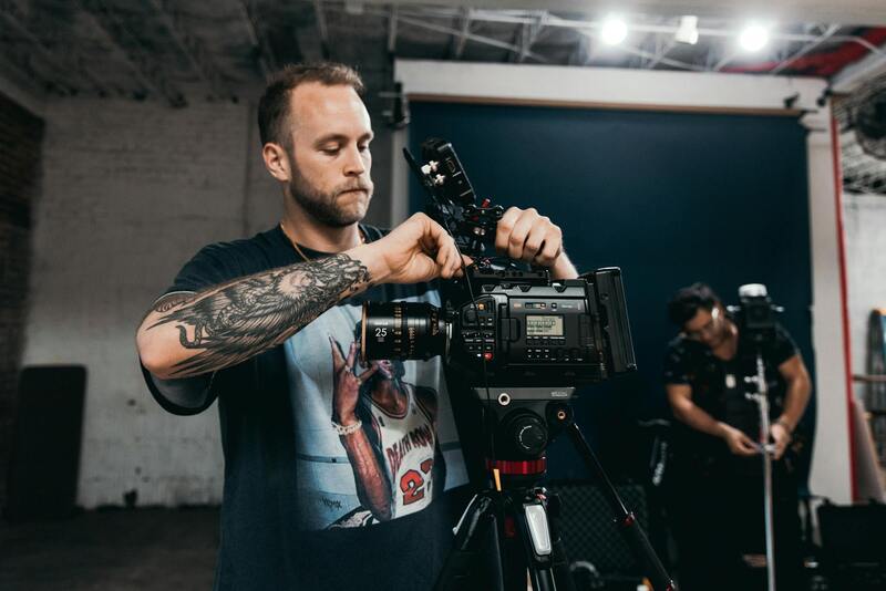
Most professional cameras record in a log profile, which stores a wide range of brightness in a flat, grey-looking image. That flatness is the point. It preserves highlight and shadow detail that a contrasty recording would have thrown away.
Log footage is not meant to be viewed as it comes. It needs a transform to bring it into a normal viewing range, and that step comes before any creative decision.
The common shortcut is to drop a look-up table on top and start grading. That works if the LUT matches the camera and the profile it was shot in, and it produces odd results when it does not. Use the transform that belongs to your footage, then adjust exposure and balance underneath it rather than fighting it from above.
It also matters that everything on the timeline is treated consistently. A sequence mixing log footage from one camera with standard footage from another needs the transform applied selectively rather than across the whole timeline, or the second camera will end up washed out.
Matching shots, which is most of the work
On a corporate or event project, the bulk of colour time is spent making shots match rather than making them beautiful.
The reliable method is to pick a hero shot, grade it until it looks right, and then bring everything else to it. Work with scopes rather than by eye alone, because a monitor and a tired pair of eyes will drift over an afternoon.
Skin tone is the reference that matters most. Audiences forgive an unusual sky and notice immediately when a face looks green or magenta. The vectorscope has a line that indicates roughly where skin tones should sit, and getting faces close to it across every shot does more for perceived quality than any stylistic choice.
Two recurring Miami problems are worth naming. Mixed lighting, where daylight through a window meets tungsten or LED indoors, leaves different parts of the same frame at different colour temperatures and needs local correction rather than a global fix. And strong exterior sun produces very high contrast, where the temptation to lift shadows aggressively reveals noise that was invisible before.
Where a look comes from
Once the footage is consistent, the creative pass is comparatively quick. The decisions are usually about contrast, saturation and where colour sits in the shadows and highlights.
Keep it restrained on commercial work. A brand film has to survive being watched on a phone in daylight, and heavy stylisation that looked striking on a calibrated monitor often reads as murky or oversaturated there. Check the grade on an ordinary laptop screen and a phone before signing off.
Watch brand colours specifically. If a company's identity is a particular blue, a grade that pushes the whole image warm will shift that blue, and someone in marketing will notice even if they cannot say why. Isolate and protect those colours where it matters.
Resist grading to match a reference frame from a feature film. Those images came from different cameras, different lighting budgets and different production design. Use references for direction, not as a target.
The order of operations
- Confirm the timeline is locked, since regrading after a re-edit wastes the work
- Apply the correct transform for the camera and profile
- Set exposure and contrast per shot, then balance colour to neutral
- Match every shot in a scene to a chosen hero shot
- Apply the creative grade across the sequence
- Make local adjustments: windows, faces, brand colours
- Check on a second display and on a phone
- Export against the delivery spec, not the editing timeline settings
That first item saves more time than anything else on the list. Grading an unlocked cut means grading shots that will be trimmed, replaced or dropped.
How long to budget for it
Colour is routinely underestimated in a schedule, usually because the creative pass is quick and the matching is not.
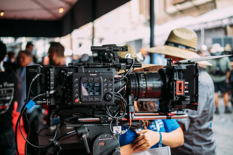
A single-camera interview piece of a few minutes might take an hour or two. A multi-camera event recap with mixed lighting across a day can take considerably longer than that, and a project shot across several locations in different conditions longer again. The variable is not the length of the finished film but the number of distinct lighting situations in it.
That gives a useful planning rule: count the setups, not the minutes. Twelve setups shot over two days will take longer to balance than a forty minute conference session recorded on three locked cameras under one lighting state.
It also means colour time is partly decided on the shoot. A camera left on automatic white balance, or two bodies with different picture profiles, converts a straightforward grade into an afternoon of repair. Fixing that on set costs a minute and saves hours.
Monitoring, which decides everything
Colour decisions are only as trustworthy as the screen they are made on. A calibrated monitor is the difference between a grade that translates and one that looks correct in your room and nowhere else.
If a calibrated reference display is not available, the practical compromise is to check on several ordinary screens and aim for something that holds up across all of them. That is not the same as accuracy, and it is considerably better than trusting one uncalibrated laptop.
Watch the viewing environment too. Grading with a bright window behind the monitor pushes you toward an image that is too dark, and grading in a completely black room pushes the other way. Consistent, moderate ambient light is what you want.
Handing it over
Deliver what the client can actually use. A graded master in a high quality format for archive, plus the versions in the formats and aspect ratios they need for distribution. Colour behaves differently once footage is compressed for the web, so review the final compressed file rather than approving the master and assuming.
Keep the project and the grade recoverable, because a request to produce a slightly different cut arrives months later with reliable frequency. What to retain and for how long is covered in archiving a finished project, and the technical side of output is in export and delivery specs.
We grade in house as part of post rather than as an add-on, and we show a graded sample early so the direction is agreed before the whole piece is finished. There are more post-production articles on the blog, background on the about page, and if you have footage that needs finishing, send us the details including what camera and profile it was shot in.